
Select Readable Typography for a Printed Book
Comfortable type size, line spacing and contrast make a book easier to read across long chapters and different lighting conditions.
Read articleThoughtful, practical guidance on writing, editing, publishing, book marketing and author support.
Comfortable type size, line spacing and contrast make a book easier to read across long chapters and different lighting conditions.
Read article
Bleed and safe margins prevent unwanted white edges or trimmed text when a print book is manufactured.
Read article
Spine width depends on final page count and paper; back-cover copy needs enough space to persuade without crowding the design.
Read article
Title, subtitle and author name need a clear order so readers can understand a cover quickly in a shop or search result.
Read article
A good cover brief explains the book’s audience, genre signals, mood and essential details while leaving room for professional design judgment.
Read article
Trim size affects page count, readability, printing options and the way a book feels in a reader’s hands.
Read article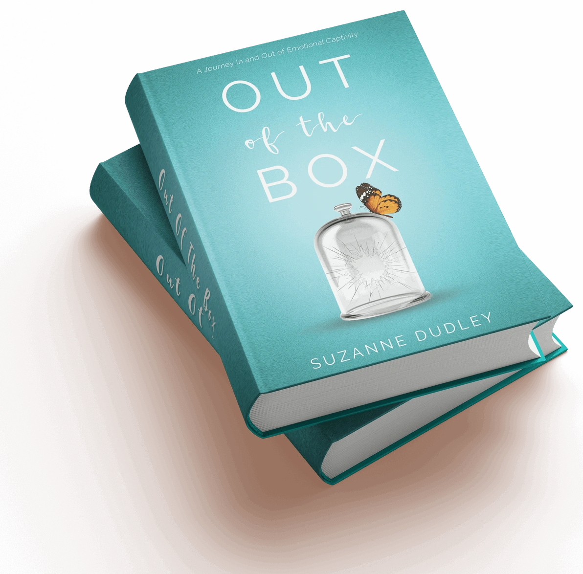
Review the final laid-out pages—not only the Word manuscript—to catch layout shifts, missing text and last-stage production errors.
Read article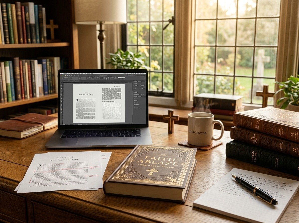
A clear table of contents previews the book’s structure, uses consistent headings and helps readers find the material they need.
Read article