
Decide When a Book Needs Color or Black-and-White Printing
Choose interior color based on how images serve the book, reader expectations and the printing options available for the intended format.
Read articleThoughtful, practical guidance on writing, editing, publishing, book marketing and author support.
Choose interior color based on how images serve the book, reader expectations and the printing options available for the intended format.
Read article
A series cover system uses repeatable visual cues while leaving room for each volume’s subject, tone and title to stand out.
Read article
Before a cover is approved, confirm that every photograph, illustration, font and stock element is licensed for the intended editions.
Read article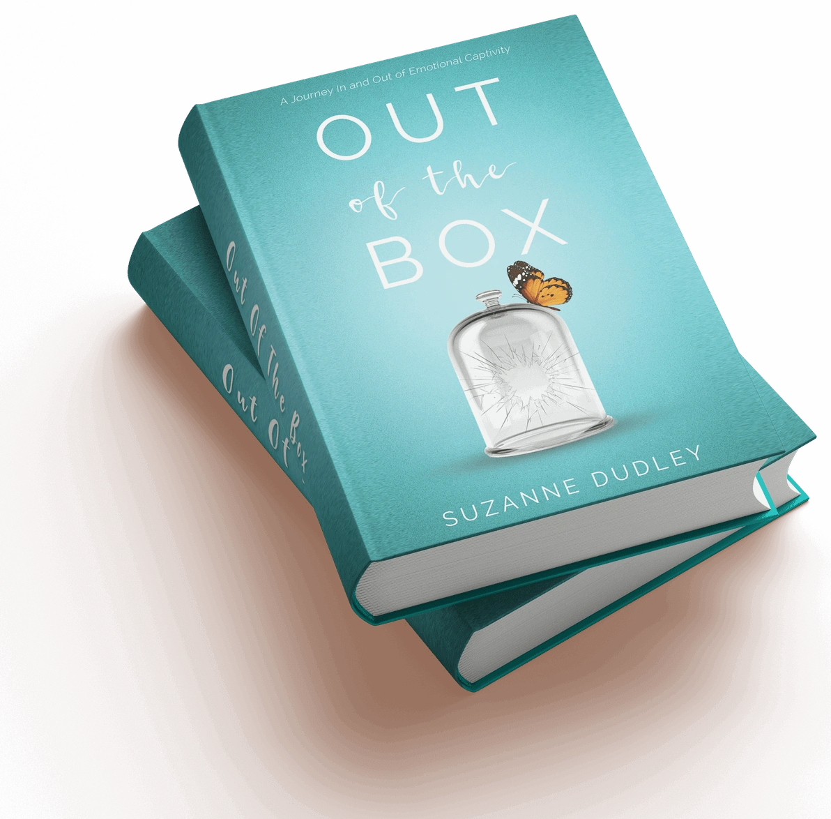
Accessible ebook practices include semantic headings, descriptive links, meaningful image text and layouts that adapt to reader settings.
Read article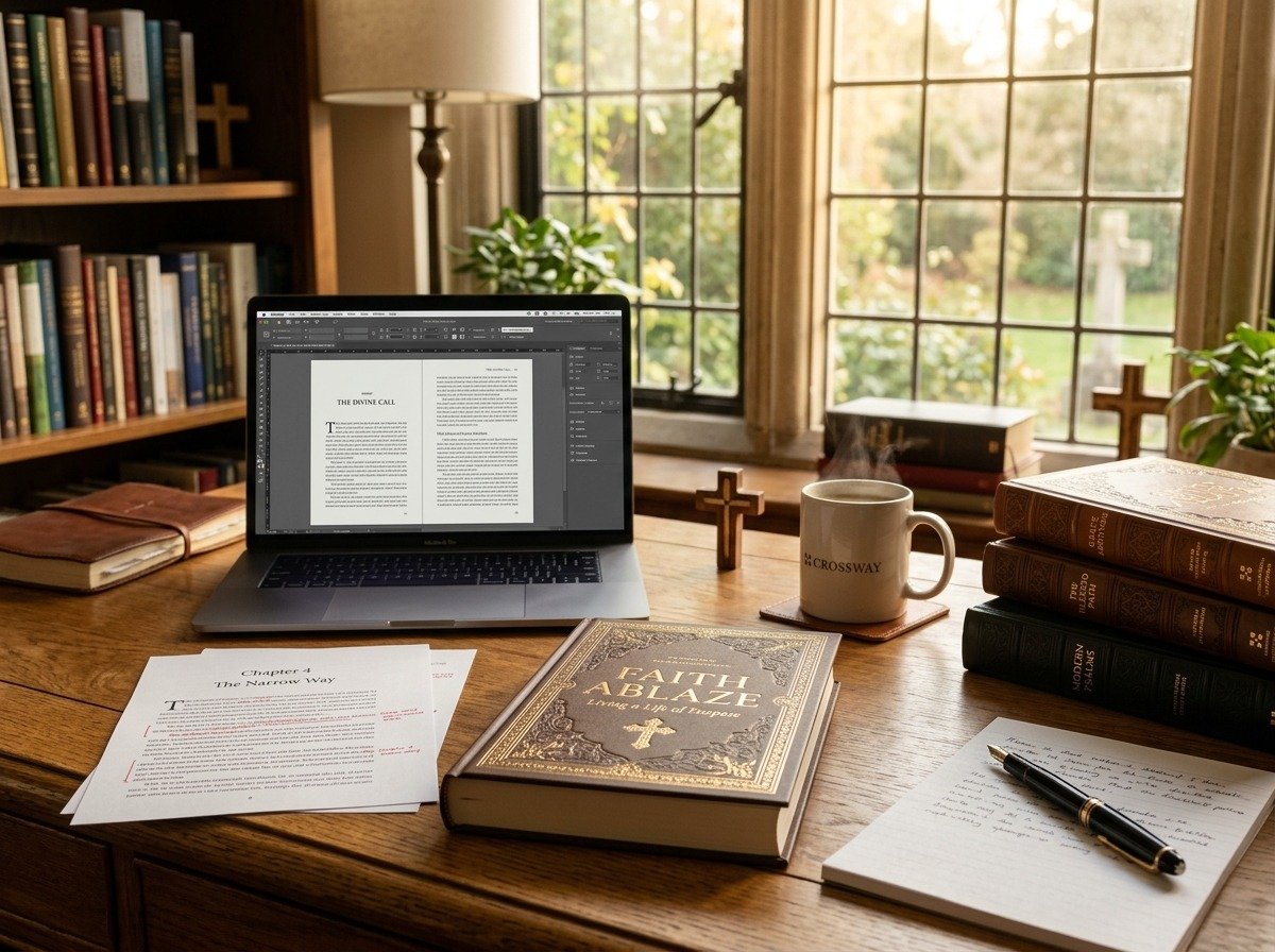
Semantic heading styles make print contents easier to update and create navigable structure in accessible digital editions.
Read article
Consistent chapter openings and deliberate white space create rhythm, clarify structure and make long books easier to navigate.
Read article
A well-organized opening section places title, copyright and introduction material where readers and distribution platforms expect to find it.
Read article
Images that look sharp on a laptop may print blurry; resolution should be checked at the final size used in the book.
Read article
Ebooks reflow across devices, so fixed print-page assumptions can create awkward reading experiences on phones and e-readers.
Read article